this year, as a woodworking teacher, i was given a challenge and gave it in return to students and others in the wider woodworking community. this challenge is simple. it’s a variation on the “draw this in your style” challenge floating around the art world and on instagram but with a design and manufacturing twist. take a historic form of furniture and design a modern piece in any style you like based on it. the restrictions, though, are what make it especially fun. as furniture, it isn’t just art. it’s craft, which means it’s meant to be useful – there’s no point in making a chair you can’t sit in or a table that can’t hold up the dinner plates. it has to be beautiful. but it has to be functional and that means a chair that’s too weak is meaningless and a table that has to be two meters tall to look right is useless because who eats dinner with the plates above their head?
so that’s the starting point. but where to go from there? it was decided it was only fair that, as an experienced instructor, i had to take on a much larger challenge than the students. they would each do a new version of five forms – bed, chair, cabinet-on-stand, tea-box/jewelry-box and stool. and i would (yes, this is a huge amount of work) do five new completely different versions of each of them. so what i’m calling “stage 1” is creating the five versions of one form. i wanted to start with the most challenging one for me, a form i’ve always struggled with because i personally don’t like the objects themselves and they’re so incredibly large and ungainly they leave less scope for decorative details compared to their sheer bulk. and they have no choice but to have fixed-dimension soft components added. i’m talking about beds. and mattresses. unlike seats, where you can make the soft components optional, beds need mattresses and those are fixed dimensions and large. anyway, this is what i have come up with and how the process has gone. i’ll go through each of my new designs and talk about how each was created. i know this may only serve a niche audience but i figure there are plenty of furniture-design students out there who don’t like to ask about the design process because they think they should know or, in many cases, because designers tend to be rather secretive about their processes. i am not. so feel free to ask any questions you like if anything isn’t clear.
pencil-post bed
having accepted the design challenge, i started, of course, like all good designers by looking for inspiration. many people will quote “good artists borrow but great artists steal” when you’re designing. or any other art process, come to think of it. and it’s very true. but there’s a question of how far you can go before you’re not doing anything new anymore. so i had to think seriously about what it means to create something new and what it means to just make a copy. there’s a very thin line between these things. for example, if you go to ikea and buy an eames-inspired chair or a shaker-style dresser, how much design work has actually been done by ikea and how much was done by eames or one of the brothers in the village? hard to tell. not that this is a judgment – a shaker dresser is a beautiful piece in many cases and it doesn’t matter who did the design as long as it is beautiful in your home. but, as this is an exercise in design, i didn’t want to simply nearly-duplicate something that already existed. my first design style, i decided, was going to be an interpretation of my favorite visual style for a bed – the classic pencil-post. i have always liked this form because it is so light yet refined and decorative without needing all the embellishment poster-beds are often known for, especially if you look at photographs from historic castles and manors from the eighteenth and nineteenth centuries. they tend to have more the aesthetic of a blocky fireplace mantle than the decorative simplicity of a light frame. where to find inspiration, though? i first went to the source, looking at shaker originals and modern copies of them. there is one thing you notice about pencil-post beds in general. they have either tapered or simple round columns as their posts. some are tapered from the middle to the top with a small foot, others from both directions to top and bottom. some have a square post detail in the middle. but i don’t generally like round posts and i’m far more heavily-influenced by the danish modern style where straight, clean lines tend to be used as detail elements rather than ornamentation and turning. so the bed became a series of square posts tapered in four directions. if you look at craftsman-style (arts-and-crafts-style) poster beds, you’ll see a two-face taper where the foot is biased in the direction of the outside edge. shaker-style furniture, though not always the case in poster-beds where thickness is more necessary for strength, are tapered in the other direction quite notably. these tapers in my version aren’t straight lines – they’re subtle curves. this can be accomplished with a simple process of mounting and wedges at the bandsaw but that’s a construction rather than design detail and i’ll focus here on design – i just want to point out that this isn’t a difficult detail to create in the final product, just an interesting embellishment compared to the typical straight tapers on many bedposts, especially columnar ones.
where to be inspired, though, is the real question here, beginning the first design of the first stage. and the answer was surprisingly simple – not furniture but trees. i looked at various photographs of forests and the interlocking canopy of branches and their thinness and simple elegance gave me a push in the right direction. trees don’t do straight lines. they do curves. up the trunk, along the branches. so my design takes the curves of branches and uses them not only for the upper arches where a canopy can be supported but the support rails and headboard/footboard panels. they’re not rising-sun-style half-circles. they’re subtle curves but i think they’d lose a lot of their appeal and look much closer to mass-produced furniture made without attention to detail if they were simply straight. even the support rails on the sides have a curve top and bottom. the only straight-line detail that gets real attention here is the square post but it’s got an organic curved outer profile contrasted against the straight linear version if you look at it directly from top or bottom. this is in many ways a very minimalist and simple bed – not something usually said about a four-post, nearly-ceiling-height piece of furniture. but in this case i believe it’s true. i think it works either with or without an actual canopy structure – as a straight pencil-post bed or a full-on silk-draped luxury in the bedroom. having the structure cross in the center rather than either at split-right-angles or in rows and columns is a way to channel the idea of tree branches in the forest rather than the more human-created style of grids and equal rectangles – neither of which i’m opposed to but in this particular design feel too brute-force and confining for the visual effect.


organic mid-century bed
the next piece i began to work on is a style most of my students and friends will recognize as my typical approach to design – minimalism, offset edges, sweeping curves. if i had to say who are the most influential designers in my life, it would be very difficult to come up with a short list or perhaps five. but it would probably look something like this.
- george nakashima
- arne jacobson
- hans wegner
- finn juhl
- kaare klint
they all have several things in common. they use large-scale curves, clean lines, wide, flat surfaces and organic forms. their furniture is all distinct but their similarities are most of why they have been so fundamental to how i design. looking at george nakashima’s chairs, for example, was the starting point for the inspiration for this bed. most of the time, designers treat a bed as something like an enlarged picture-frame sitting on the floor with legs where the art is replaced by the mattress. i have no problem with that approach but i wanted it to be less a picture-frame than a comfortable place not simply to sleep but to rest, work and read. the problem with the picture-frame approach is that the headboard tends to be decorative and usually very uncomfortable. taking the curve from when i design simple chairs and turning that into a place for the back to make the bed a usable piece of furniture during the day is something i’ve always tried to do but it’s not always possible. in this case, though, it certainly is. an organic split headboard is relatively simple to visualize but getting that curve to be dramatic enough to be beautiful but subtle enough not to feel like you’re in a recliner when you lean against it is certainly a balancing-act.
this is a place where i should probably talk about construction details, especially as they’re not necessarily visible here. this bed would be made from mostly solid stock (walnut), of course, for strength. but the headboard is an exception. there are two ways this can be achieved – mixing materials and veneer or simply veneering a segmented panel. i opt for the second in this case because it’s non-structural but the more-involved mixed-material approach would be perfectly fine as a way to build this headboard, too. what i mean by segmented panels is that instead of trying to bend wood to form the headboard or using layers of veneer stacked from face to face, this panel would actually be a series of 19mm plywood cut to the shape of the curve in cross-section then laminated and veneered on all six sides. this gives incredible strength not just through the multiple glue joints but the inherent strength of the plywood – in this construction, it has glue in all three directions against an axis rooted in the frame so you get torsional rigidity without adding weight or density. to shift to the mixed-materials approach, this same process can be replicated but, instead of simply stacking identical plywood curves along the direction of the headboard, metal panels would be cut to the same curve and sandwiched between the plywood curves to add strength. these would be adhered to the two plywood panels on each side in the lamination using countersunk fasteners then the plywood would again be glued in cross-sectional lamination. this provides a stronger panel than the straight-plywood-lamination version and is very useful for the construction of chairs but, in this case, is unnecessary and adds a significant level of complexity as routing a template for that curve in plywood is easy but, in metal, requires significant metalworking tools and more refinement time for no significant benefit in practice. as for the rest of the construction details, the bottom of the bed is supported to avoid those curved feet having to take all the down-pressure of people sleeping on the mattress. they would, in practice, likely hold up quite well but there’s no reason to take that chance and have people break a bed that involves so much intricate shaping and construction when the risk isn’t necessary. the support feet are moved back far enough that anyone standing in a bedroom wouldn’t see them without dropping to the floor and the bed then looks like it is floating on extremely thin curved legs. these are a detail mostly reminiscent of traditional shinto temple design, something that was often incorporated in samurai armor and some of the early buddhist temples in japan. the non-mitered corners of the bed strike me as far less western. i’ve always hated mitered corners so you will likely never see them appear in my work unless what we’re talking about is a mitered-corner box – even then i tend to use other methods than having a visible miter. i’m totally fine with having box sides come together in a miter but i will usually do my best to avoid having that miter seen on top or bottom, even when the box is open. so in such a visible place as the edges of a bed with wide platform sides it would be unthinkable for me to have a 45-degree anywhere when a straight line is far more pleasing and simple to the eye. this gets the construction closer to frame-and-panel than traditional picture-frame. the actual construction is completed with hidden integral-tenons on the flat rails and floating-tenon joinery is used for everything else. the process could be done with floating-tenon joinery in all the components but there seems no reason to avoid integral-tenon joinery where it is possible and the tenons can be far larger as a result, providing extra rigidity in the platform components.


storage bed
one of the things that bothers me about beds in the western sense is their massive size and permanence. japanese beds are traditionally only a padded cushion on the floor. it’s much the same as putting a western mattress on the floor and feels mostly indistinguishable from that with one important difference. it’s not usually possible to fold a mattress. the japanese version, however, is designed to be folded and put away in a closet in the morning to be taken out in the evening when bedtime approaches. this means there’s no need for a dedicated space to sleep or a dedicated room to sleep in. in western homes, the space dedicated to the bed is generally wasted the rest of the day and this has always struck me as odd. the solution to this has been seen as things like the murphy-bed, which i don’t understand – why have a folding bed frame when you can just have a folding mattress and avoid all the complexity? i think a far better option is to take the footprint of the bed and make it functional as something other than a bed at the same time. i’ve always liked storage beds – i had one as a child for most of my teen years and it was incredibly useful in a small bedroom. so, given the challenge of designing beds, it is only natural that i incorporate storage. in this case, i have taken a traditional craftsman-style storage bed and turned it into a more organic, asian-inspired bed without losing the functionality of the under-bed drawers. drawers, unfortunately, tend to be boxes with rectangular edges and that makes them blocky and uninteresting. they can be decorated with carving or color, embellished with complex visible joinery or simply accentuated in a brutalist style. in this case, though, i took a different approach – turning the drawer shapes into intersecting curved shapes closer to leaves than storage boxes. the curves are more exaggerated than my usual soft organic shapes but with such a large form as this i believe it’s necessary to make the curves clear and decisive rather than almost-hidden and easily mistaken for straight lines at first glance. wood selection is very important in these large panels. in this case, the frame is dark-stained cherry and the decorative panels are veneered with highly-figured cherry with continuous grain. the match doesn’t have to be perfect but being visually matched makes the dramatic contrast less visually-jarring. the same effect could be achieved with solid-wood panels but the expense of this for beautiful grain in those sizes is prohibitive and veneer in these cases is a far simple option – it also eliminates the need for incorporating floating panels as the veneer-and-plywood approach negates the potential for seasonal-wood-movement on large elements like headboard panels and inset drawer-fronts.


simple children’s loft-bed (taking a break)
sometimes when completing large-scale design projects, i like to take a break and work on something in the interim. it keeps my ability to focus on highly-elaborate designs from getting distracted and bored, something i have struggled with my whole life. i easily lose motivation when a task is monotonous or loses its challenging aspects. what i often supplement design projects with is actually short design exercises to help the woodworking community with simple projects. there is a flood of simple plans on the market, often free or cheap, to build everything from dressers and beds to chairs and boxes. the problem is that most of these plans are difficult to follow and uninteresting. they’re either so boring nobody wants to actually have the finished project or so complex beginners don’t bother to try them. i have tried for the last few years to provide free plans to students and other woodworkers of easy-to-complete projects for furniture for their homes that are interesting and aesthetically-pleasing enough that, even if they weren’t limited in experience building, they would want the furniture. while i was thinking about beds, i realized there was one thing that i had never seen a freely-available model for that was within the grasp of most beginner woodworkers. the result was putting together and making available this model of a loft-bunk-bed. it’s simple and uses clean, straight lines – squares rather than rectangles. it doesn’t have complex joinery or construction and it’s meant to be mounted against a wall for extra strength, as most bunk-beds tend to be. it incorporates a simple desk but is mostly just a straight-forward bed for two children. i imagine this is what the shakers might have imagined for such a project if they had needed to house two children in a room, though that’s just speculation.
this raises another interesting topic, of course – the cost of woodworking plans. while i, in theory, respect the right of people to make their own decisions and i won’t get into a discussion of my issue with the trade economy and competition, i make all my plans, diagrams, drawings, models and renders available at no charge to the woodworking community as a volunteer service. i love design and building and i will happily charge money to create a new piece for a client. and i am happy to be paid to teach classes. but i see no reason why students and woodworkers out in the world should be restricted from making interesting and beautiful pieces of furniture simply because the only freely-available plans are boring and simplistic – or, in many cases, poorly-thought-out to the point that you see workbenches with complex fastening solutions that will fail in a matter of months and chairs held together with nothing more than screws where failure is only one two-legged-reclining-action away from the first day they’re used. so the result is items like this and many simple projects where i produce step-by-step plans and dimensional drawings to accompany rendered models. i am happy to do that for a community that has supported and nurtured my love of design and building and anyone is welcome to my cad models, too, if that’s useful. it’s nice when people give me credit for my work but i understand that’s not always the case and it’s a risk i am prepared to take if it means more people get out there and build beautiful things.


floating-platform bed
in the spirit of channeling george nakashima, i returned to my japanese-danish-mid-century design roots with the next design and modeled it on a totally different type of chair. this concept is loosely based on a nakashima chair i once saw in a museum exhibition, though i can’t remember what it was called – the chair, not the museum. either way, it’s unimportant but if you look at any genuine nakashima furniture i suspect you’ll see the chair i mean. the inspiration is loose but unmistakable and i tip my hat thoroughly in his direction for this. it doesn’t resemble any of his bedroom furniture designs but credit is certainly due for the inspiration. the story (no, not every piece has to have a story but this one does) is that this is the bed equivalent of a floating slab-top table. the difference is that the tabletop isn’t on the top. it’s under the mattress and the curve scoops up the mattress and gives the impression of movement away from the headboard, which is angled and curved. the curve matches the one on the bottom of the platform and the angular meeting between the headboard and platform provide a human contrast with the organic shapes on the opposing faces. the whole structure appears from a distance to be floating but has solid, square, straight-line feet and an underframe to support the bed firmly from below. the through-tenons on the headboard give it strength without needing the lamination approach on some of the other designs here – the headboard is also fairly light. the contrast is accentuated by the combination of wood species – the majority of the bed being built from walnut but the slats coming from the rich red tones of cherry selected to avoid uniformity but this could easily be a more decorative exotic wood – jarrah would make a great tone in keeping with the red or padauk, potentially. using something very dark like wenge or ebonized oak would give contrast in the other direction and that would work well for this piece, though i think the lighter tone on the headboard sets off the dark exterior more clearly. the blocky, elongated squares tapering to thick rectangles gives the impression of solidity to balance the floating platform and airy, almost insubstantial headboard that is deceptively thick when measured but takes little visual space. the undercarriage of the bed is far more solid than the other designs in this challenge as the bed is not resting on outside feet, taking the slats only for mattress support. the whole frame, which is relatively heavy because of the thick walnut components and floating headboard, must also be supported by the four legs so their strength is distributed through the frame using lapped cross-members the entire length and width of the frame, keeping everything solid.


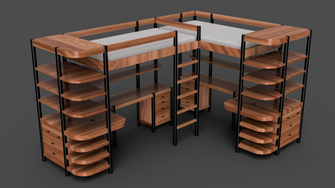
lofty childhood ideas
having allowed the idea of a loft-bed (or bunks in general) to live in my mind for a little time, i was prepared to come back to address the concept not just to create a beginner project for the community and students but a serious design for a whole-bedroom-in-a-single-piece bed. this is a considerable departure from the previous designs, not least because it’s not a single bed or even a bed in and of itself but two beds – not for adult clients but children. not that the bed is too small for an adult but most adults have moved from single beds to large ones at ground-level (though honestly i have no idea why, come to think of it, as i am completely happy with a single bed – i prefer floor-level, though, to ceiling-height because climbing that ladder for me would be more than difficult). this is the result of an interesting mental exercise. i thought first about the styles i truly love in furniture – danish modern, scandinavian minimalism, japanese minimalism, shaker. then i turned around to look at other twentieth-century styles i have far more a hate relationship with than one of love. bauhaus came immediately to mind – does anyone truly need all that concrete? it’s like taking the overwhelming nature of brecht’s refusal to acknowledge the lessons of the past and applying it to architecture and, mostly by accident, it seems, furniture. but more to the point are the styles i’ve never really understood or appreciated and likely won’t at any point soon – art deco and art nouveau, which are often seen as a continuum but i tend to imagine as two distinctive stylistic aesthetics. so my walk through experimental images in my mind took the form of a single question – if i had been designing at the height of the deco movement, taking its cue from the art nouveau period that just predated it, with all its blatant large-scale curves, thick panels and frames and unsubtle contrast transitions, could i design in that style without breaking my own design sensibilities. the result is this bed (bed-ish, you could say and still be quite accurate as it’s two beds, two desks, four dressers and an awkward number of shelving systems, depending how to decide to count them).
having explored the idea of deco more thoroughly (i am forever grateful for museum collections existing online, though i do wish more of the museums with huge furniture collections would photograph them and share the way they have with their oils and inks), i embarked on the idea of a different question. assuming i am living in the twenties (the nineteen-twenties, not the twenty-twenties, which i believe would have been a much safer place to live in many ways, though whether the great depression was more potentially-dangerous than the current combination of viral pandemic and generalized self-obsessed idiocy i have no idea) and designing furniture, what would a child’s shared bedroom setup look like. could i make something with enough interesting large-scale curvature and bold lines to fit the style but be subtle enough to satisfy my desires for clean and unadorned. the result is the contrast between ebonized frame pieces and figured cherry but meshed with a lack of offsets, flush-mounted inlaid drawers, hidden joinery and shelving on grain-matched runners, eschewing decorative elements for more bold geometrics and color contrast. these desks are large for children and there’s plenty of storage for even the most collection-obsessed – assuming there are closets or wardrobes, of course, for the myriad clothing children seem to have for all potential events in the modern world, though this exploding wardrobe size for someone who is about to outgrow it all any moment (or even someone who isn’t) confuses me more than most things about western consumer culture. that being said, though, this bedroom furniture is hopefully something that could be around for a child’s life, being comfortable and soft enough for young children and simple and modern (an interesting thought for decor of the twenties that can’t really be said of some later decades of the twentieth century) for teens and possibly go on to another generation, though i always hesitate to imagine my furniture designs being passed along as family heirlooms. the whole structure sits above the ground rather than being flush like most stroage-type bed units, making it feel more light, despite its large visual weight. the open design of the desks with shelving above and beside contribute to this, too. it’s all-too-easy to box things in with loft beds and storage units, making the whole thing feel like a built-in in a dark room, especially with wood-grain, something i hope this has avoided with its pass-through, free-standing aesthetic. even the dressers stand well off the ground to eliminate that sense of weight and permanence children often react badly to. my original thought was to have a single curved ladder in the center but, unlike a century ago, safety regulations conspired against that idea and recommendations from governments say straight ladders are the only way to go for commercial furniture, a trend i feel i should copy in this. i make up for it with the aggressive curves on the desks and shelves, both the small shelves above the desks and the much larger ones to hold books and clothing above and beside the dressers. in practice, this unit could be modified to be two beds end-to-end and mirrored by rotating the perpendicular unit ninety degrees and shifting the ladder half its width to the right – i expect if i have an opportunity to build this again that might be the requested form, depending on the dimensions of the room it will live in. even without shifting the ladder, that solution would be functional with minor adaptations. these are not strictly mirror images (see the support beam above the left side of the desk on the short leg that doesn’t appear in the other segment, for example) but they are close enough to make that modification work without much difference in the design phase. i would have said this would be the most interesting of these designs to build and the one i was most looking forward to at the time. but that was about to change with the introduction of color – just wait and you’ll see what i mean. i believe this is the most practical room design i have yet created, though. that may be the greatest irony, starting from the least-functional of styles (self-admittedly and by design, if you read literature of the deco movement) and coming up with an extremely practical and functional piece. i guess that’s what happens when a mid-century minimalist dives into the recent past.


the book’s a foot(board?)
in the interest of all things simple but with subtle details of custom design and organic flavor, the final bed in the challenge was the answer to a different hypothetical question – given true straight lines, blocky squares and inset overlays work in cabinetry and small pieces, can it work effectively at the size of a full bed or is it simply overwhelming in its bulkiness? i believe it works, keeping a few things in mind. i originally thought of this as having drawers and storage at floor level and that simply gives the piece far too much weight from a visual perspective. having small storage at the top creates balance but at the bottom feels more like an overweight posterior outstripping the beauty of a lean upper-body. the open shelving and double braces rather than much thicker large single braces adds visual airiness and allows the piece to float, especially with its fairly-high legs combined with its low-mounted mattress, connected to the bottom of the lower stretchers rather than, as is more typical in split-stretcher bed designs, the middle of the upper one to allow the bottom to be the frame and brace for the structure. the shelves at the end would work as bookshelves or clothes storage depending on need – in my case, it would certainly be books as i have dramatically more of those than clothing, something i am more than happy with on reflection. the wireframe aesthetic conveyed by even these fairly-thick double-rails and single-posts feels modern without being experimental and the whole piece, i hope, looks solid without being blocky, especially with its inset drawers. the curved shape of the headboard makes it comfortable to sit in for hours and work in a way a straight headboard wouldn’t and it is surprisingly small for a full-size bed. a single-bed version of this would be even more minimalist – the single version, by the way, has three columns of drawers, the left being two drawers mirroring the four on the right but with no other significant changes and, though i have mostly showed all of these in their queen-size forms, i can honestly say i prefer this in its single implementation. i have been careful not to show the king-size versions as the example pieces because they start to become all-too-square in their proportions. queen is a good balance and by far the most common size requested from custom furniture makers in canada and america today, anyway, so it’s an honest representation. it could be rather more overwhelming here in image and speed if i shared all the versions of each bed! i have only showed the children’s beds as single and adult-focused ones as queen.


reflections
so that’s five and that was the challenge so i turned my attention to reflecting on the process and what i have gained and experienced through the creation of these designs. but there was at least one more thing i didn’t feel like i had completely fleshed-out and i couldn’t leave that undone. what was missing? i’d done history, curves, contrast, hypothetical trips to the days of speakeasies and functional minimalism. what i hadn’t done was color. of course, i wouldn’t be the first wood-obsessed woodworker to avoid using anything but natural wood color – and, in my defense, i did use ebonized accents and frame components, covering the natural wood. i was thinking deeply about the milk-paint i often use in my design. but that didn’t satisfy. what i needed was (gasp) veneered plastic laminate. and not just as an accent. as a design feature on a large scale. this is something i’ve tackled before but only in small (read decorative casework) pieces, never something that was the primary element in a room like a bed or dining table (stay tuned – more colorful laminate is on its way in another form, i assure you – colors are more contagious than viral coronas). so there are reflections on the process i want to share but first i want to take the whole notion of reflections and share something far more literal.
thinking about the notion of colors and reflections, i found myself looking for inspiration in an unlikely spot, a designer whose work i have always respected but generally not liked very much – frank lloyd wright. what has continued to inspired me, though, from his work isn’t his architecture, which i find painfully childish, or his furniture design, which is all-well-and-good but i don’t like medieval castle furniture and it’s painful to actually sit on those chairs with their awkward proportions and straight backs – the shakers did it so well and he simply ignored their ideas and designed furniture like buildings, pretending humans don’t have curved body parts. but his glass accents intrigue me. they are a bit too abstract for much of what i want to accomplish in a minimalist way – and especially for a young audience, who would probably find the sheer complexity of the patterns overwhelming. but i wondered what might happen if those interlinked curves of color might work as solid elements, not just for decoration but structure in a piece. taking as inspiration the idea of the roma (also romany, though i’m not sure which actual members of this culture prefer and i’m happy to change my terminology if any of you are and wish to let me know what is the correct or most appropriate term) horse-wagons in a loose sense. that overlapping curved top and ranked design was a starting place but my abstract sensibilities felt the need to make it asymmetrical rather than just having the center of the arc be in the middle of the piece rather than at the edge of the bed. this configuration is far closer to traditional korean and japanese structures from the first millennium but it feels surprisingly fresh more than a thousand years later when transposed indoors.
i personally like this color combination but any combination of colors would work just as well here, depending on the target audience. even shades of gray or simply frosted white or black panels would have much the same effect. this is a piece where construction details and methods are likely of significance, though. before continuing with that, i want to make a few other points about the lack of shelving and divisions. adding extra divisions on the long shelves is certainly possible but it impedes the visual openness and i feel it is unnecessary – bookends would be preferable to dividers from an aesthetic perspective and these shelves can be used from both sides. a rank of books facing out and a different set facing in would be an excellent use of space and doesn’t feel like it adds and weight to the unit. extra shelving above the desk would require an extra pair of supports that looks out of place or extremely lightweight shelving mounted only connected to the back using a cantilevered design. even that, however, feels like it takes away from the open-concept nature of this piece, which is already quite heavy from a visual perspective with its low overhang on the bed side and its deep color palette.
one last thing before talking about actually building the piece rather than just the design. i have designed two variants of this, not just multiple sizes for different mattresses. one has a solid roof, the other with wood-framed plexiglass skylights (or, potentially, simply open to the air, the plexiglass inserts resting on mounts anyway and easily removed). some people like being able to look up at color while others prefer having more visual openness and light. it’s an aesthetic choice and i believe both work, though i personally prefer the skylight version.
in terms of construction, the frame of this piece is all built using walnut and loose-tenon joinery. the only complex work is in the headboard (which isn’t difficult, just a bit of a layout nightmare) and the roof (which is, i admit, one of the more practically-difficult things i’ve designed but not for the reason other woodworkers might immediately think as they’re probably looking at creating those curves in the wrong plane, making the whole thing a true disaster of complexity). let’s look at how it’s built starting with the headboard – i assume square-profile rectangular prisms and loose-tenon joinery don’t need an explanation and the drawers are inset-groove and rabbet construction with laminated fronts and inset holes as pulls rather than protruding ones, keeping with the flat and simple colorful motif. to create the headboard, there are two options – plywood lamination or steam-bending. that overlooks the obvious, though. a single board doesn’t have to be cut only in directions perpendicular to its axes – these frame arcs are actually cut from walnut boards as outlined curves rather than trying to bend anything. imagine the board with its edge facing straight up and its face pointing to the bed. tip the left side of the board at an angle until the board covers the area of the arc then scribe and cut each arc on a board in that orientation. this goes against the standard notion of what direction the wood in a curve will follow but it is beneficial in this case, leaving the beautiful face-grain of the walnut facing the bed rather than the ceiling – an added benefit of this method. the colored panels are simply plywood laminated to thickness with plastic veneer adhered to the outside (the adherence method of choice here is structural epoxy, by the way, if that’s useful to know, though many glues will work for this, even, contrary to popular-believe, pva, which is surprisingly strong bonding to plastic if the mating surface is sufficiently scored and roughed before the process is completed – i have done this with epoxy, pva and polyurethane glues, beyond strict urea-formaldahyde glues specifically for veneering, with good results in all cases but far better strength from epoxy, unsurprisingly, as it is a plastic-to-plastic bond). unlike the other colored panels in this work, which are all flush with their walnut mounts, the headboard offsets the colored panels to give more visual depth but, more importantly, allowing the panel to sit in a groove running around the inside of the headboard pieces, giving extra strength to a piece that will be leaned on for years. this might be a good time to point out something obvious about the framing material, by the way. i designed and imagined this as walnut with colored accents but it is, unlike most of my design work, not married to the choice of material – this would work well with oak or cherry but it could even be done with pure white or black frame pieces and have much the same aesthetic but a completely different mood sensibility. it is only pictured here in detail in the way it was conceived but it is interesting to imagine it, for example, with a bleached-oak frame and a series of blues from dark to pastel as color accents, conveying a completely different look and feel. a sample of three of these alternatives is added at the end of the photographs to show just one potential way to adapt it to other desires for color.
the real question, though, is how to build the roof structure. the simple answer, from my perspective, is to apply veneer to multiple arcs cut from plywood and that is my construction method of choice for this entire piece beyond its frame. let’s begin with the frame, however. the same strategy is employed for cutting the arcs as those on the headboard. the arcs are significantly larger, though, so they have to be constructed from multiple edge-laminated segments of walnut. if attention is paid to the grain structure, though, and layout is done carefully, the joins are invisible at all but the closest distance and the curve hides any glue line as it’s not in-line with the horizon or the edge. the frame pieces running parallel to the long axis of the bed are simpler. they are cut to square-dimensional shape then the entire piece is assembled and these are smoothed by sanding to the existing line from a template. the arc is quite gentle across any section as narrow as those frame pieces and sanding the curve required takes only a few minutes by hand. the colored panels are a different story, however. forming them in this way would be cumbersome and – not to dwell on the point too much – silly and wasteful. the answer to these is far more pragmatic. the curve is cut in the same way as the walnut edges but there is no need to do it from large, laminated sections as each panel only needs to be made independently. the long frame pieces are joined using loose-tenon joinery to avoid the need for lapped joints and the same procedure is used for the colored panels, too. they are done using a set of laminations in cross-section of plywood then the entire panel for each block is veneered on two faces with colored plastic veneer, as the flat panels were done, using a vacuum press. this process is relatively straightforward and only requires good glue adhesion. each panel is cut for loose-tenons then the whole roof structure is assembled and glued, lifted and mounted to the top, again using loose-tenon joinery as is the case for the rest of the piece.
one last construction detail remains. the optional skylights are cut perpendicular to the plane tangent to the center of the curvature of the roof. the way this is done is actually quite simple. each panel that is receiving a skylight inset is put in a jig where it is mounted with its central curvature tangent to the horizontal structure of the jig and template-routed using a plunge-router descending as if it was flat against the its plate. the only caveat to this is that it requires a long bit but that is not a significant problem as such bits, while somewhat prohibitively-priced are easily-sourced. this could be done on a shaper but there’s no need for such heavy equipment for fairly small panels and insets, not to mention their geometric simplicity. once the skylight holes have been routed, 8mm walnut strips that have been bent around forms using steam are attached to the rims and sanded flush. the only bond necessary here is glue between the edge-strips and the plywood as this is a non-structural joint and it is wood-to-wood with no potential for seasonal movement shifting the segments.


final thoughts
of course, this is only the end of the first stage and i have four more forms to go but i have some initial conclusions. the first is that this is an amazing exercise and i would recommend it to any furniture designers looking to explore their ideas. the second is that what i have come up with in this more abstract way, without being restricted by my usual requirements of “what the client will buy” or, more frequently, “what the students can build in a unit or semester” has truly surprised me and stimulated what i hope will be some interesting ideas in future pieces. one final note, it’s important not to become too complex and theoretical. while i was working on this, i found myself having to be very careful to remain true to the idea of things i can actually build and that people might actually want in their homes – this is a cautionary note because i found myself drifting all-too-often. that being said, i hope you will all take this challenge with me and design at least one style of each piece on the list. those five forms, once again, were bed, chair, cabinet-on-stand, tea-box/jewelry-box and stool. see what you come up with – you don’t have to share but i encourage you not simply to put your designs out there but to reflect on them like i have and explore your inspiration and motivation for each decision you made. it will make you a better and more self-aware designer. until the next stage is complete, may the force and the fusion be with you. thanks for reading.